A Decade of Letterpress: Juliet Shen
January 4, 2021
Each year, in a project led by Sierra Nelson and Ann Teplick of Writers in the Schools, and the School of Visual Concepts, long-term patients from Seattle Children’s Hospital and a team of letterpress artists join forces to create an extraordinary collection of handprinted, limited-edition broadsides. In 2020, the Letterpress Program at the School of Visual Concepts became a new organization, Partners in Print, in order to maintain meaningful community collaborations like this one.
These works of art—which you may have oohed and aahed over at the SAL info table at in-person events or seen at local libraries or galleries as they toured around Seattle—are always colorful, fantastical, and deeply felt.
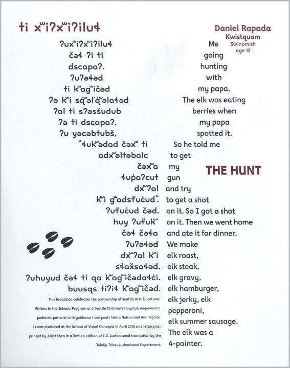
To celebrate a decade of this letterpress project, we’ve asked artists behind the press to give us an inside look at the process of turning youth poetry into art in a series of retrospectives on some of their favorite pieces over the years. Below, Juliet Shen talks us through that process, focusing on “The Hunt,” a 2016 broadside created using a poem by Daniel Rapada (then age 12).
How many years have you participated in the project?
All ten years.
What drew you to the poem you worked with?
I was drawn to this poem because the author, Daniel Rapada, was a member of the Swinomish tribe, whose native tongue is Lushootseed. Daniel’s mother was interested in having the English poem translated into Lushootseed, and since I had designed a font for Lushootseed, I could do the bilingual typesetting. The translation was provided by language teachers of the Tulalip Tribes.
I also liked Daniel’s poem a lot. I think it subtly reveals an important father-son relationship through a simple hunting story. Yet, because it is a past memory, there is a feeling of emotional ambiguity, too.
Where did you find your inspiration?
A lot of my inspiration comes from problem-solving. I am not an illustrator, so I didn’t try to draw an elk. Instead, I typeset the words in a shape that would look like an elk from a distance. I printed black elk tracks as a clue, and some of the tracks are blind-embossed on the white background as well.
The written script for Lushootseed was devised in the 1960s, utilizing the Latin alphabet with phonetic symbols and accents. When typeset in Times Roman, it looks contrived. I designed the Lushootseed font to look indigenous. The letters are based on traditional shapes found in Salish art; for example, circles that are wider than they are tall and are somewhat flattened at top and bottom. And, there are no geometrically straight lines in the strokes because I wanted the shapes to feel like wood carvings.
What’s the process like to turn a poem into a broadside?
I look for a poem that I can interpret visually and that touches me emotionally. Sometimes, the words themselves describe objects that can be represented through illustration. At other times, you have to find a way to translate an abstract idea into a visual environment that supports the poem conceptually without imposing a literal interpretation on the words.
When you are not working on this project what do you do?
I am a painter and a font designer. I retired from owning a graphic design firm and teaching typography at SVC.
Thank you, Juliet!