A Decade of Letterpress: Sukhie Patel and Carl Montford
December 30, 2020
Each year, in a project led by Sierra Nelson and Ann Teplick of Writers in the Schools, and the School of Visual Concepts, long-term patients from Seattle Children’s Hospital and a team of letterpress artists join forces to create an extraordinary collection of handprinted, limited-edition broadsides. In 2020, the Letterpress Program at the School of Visual Concepts became a new organization, Partners in Print, in order to maintain meaningful community collaborations like this one.
These works of art—which you may have oohed and aahed over at the SAL info table at in-person events or seen at local libraries or galleries as they toured around Seattle—are always colorful, fantastical, and deeply felt.
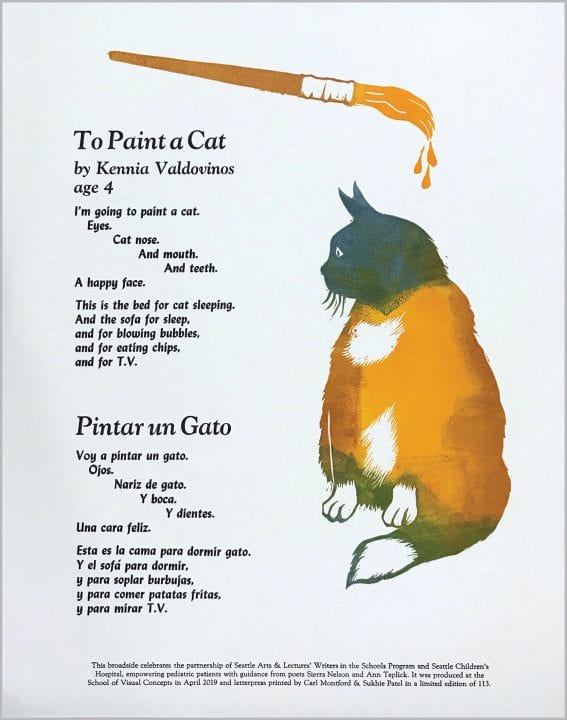
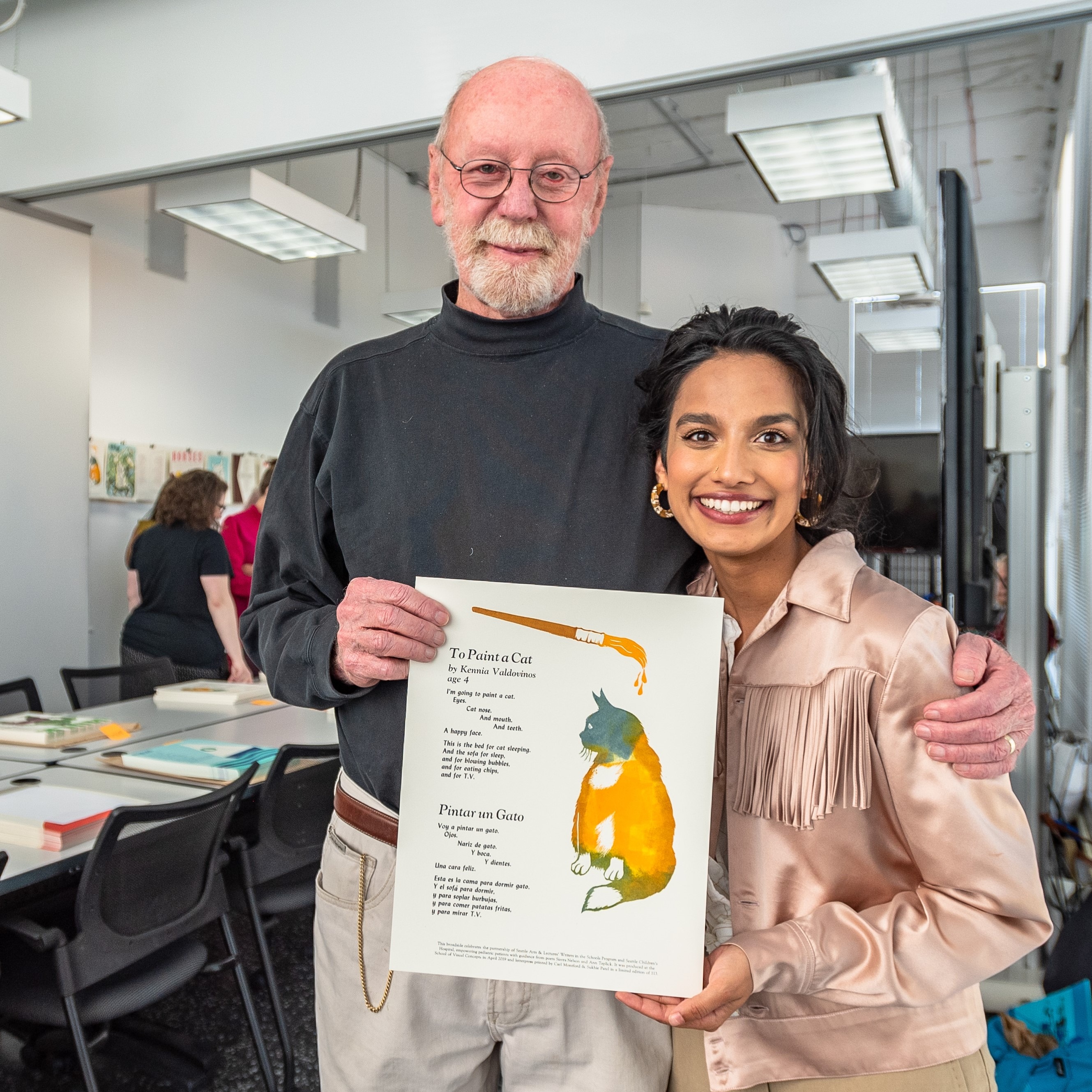
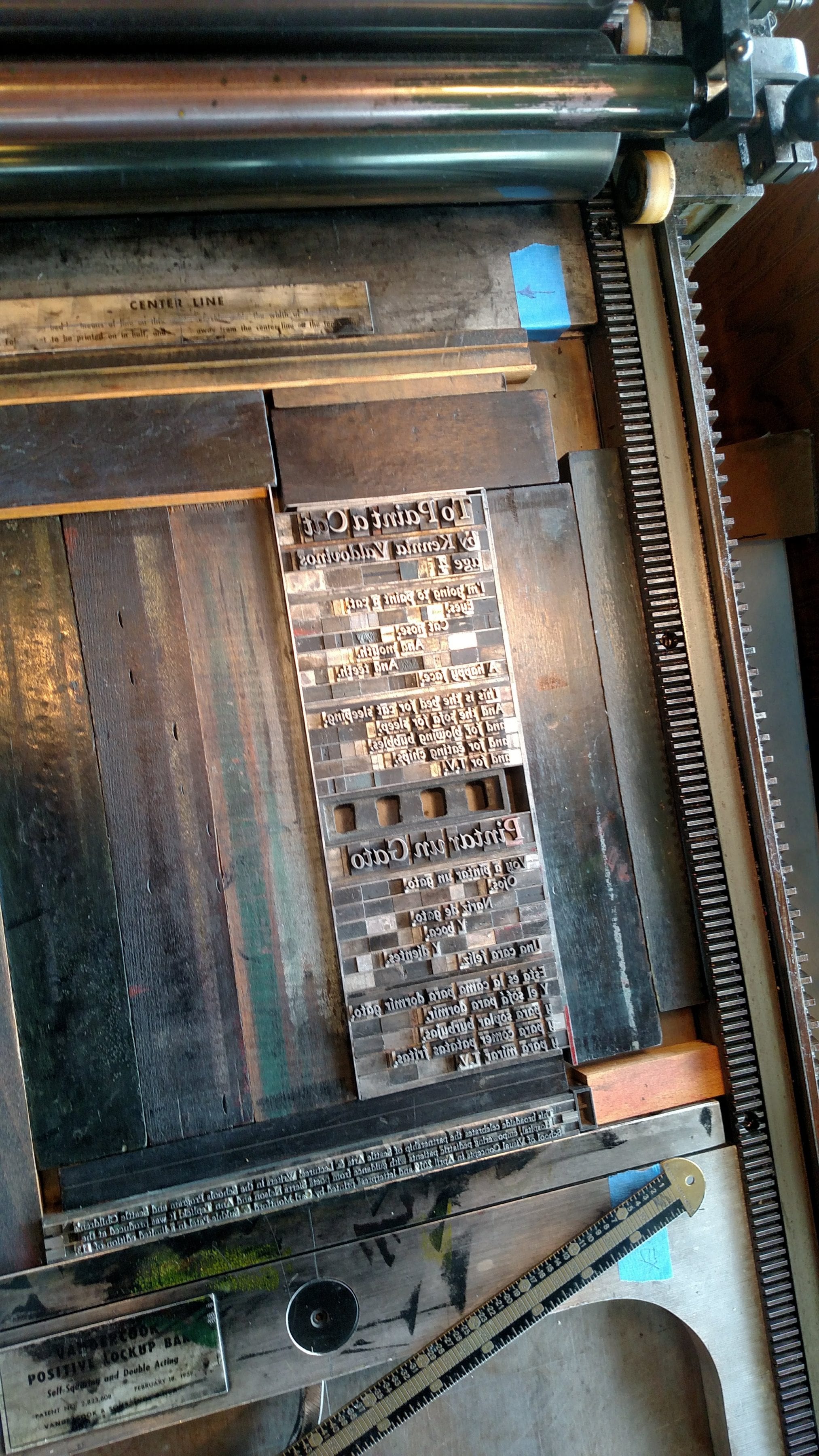
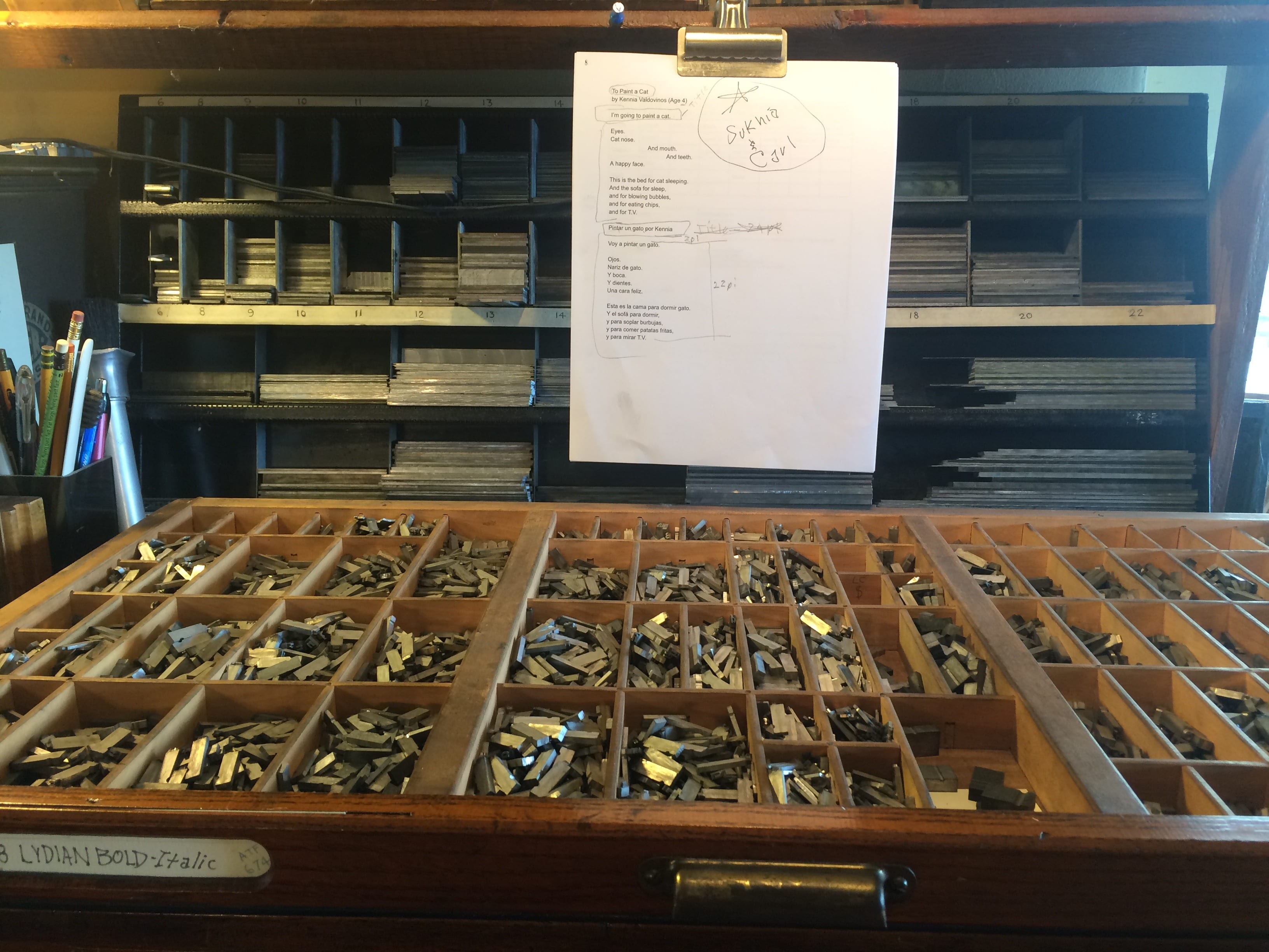
To celebrate a decade of this letterpress project, we’ve asked artists behind the press to give us an inside look at the process of turning youth poetry into art in a series of retrospectives on some of their favorite pieces over the years. Below, Sukhie Patel talks us through that process, focusing on “To Paint a Cat,” a 2019 broadside created by Sukhie and Carl Montford using a poem by Kennia Valdovinos (then age 4).
What drew you to the poem you worked with?
Well, I (Sukhie) was unable to attend the poem selection evening, so I had to trust Carl to snag something special for us. He knew that we’re both drawn to cute critters, so this was a natural fit. I think he told other printers that I would be cross with him if he didn’t come away with an animal themed poem, but I’m willing to play bad cop in this buddy comedy. As an immigrant myself, I loved that this poem was bilingual, and that the poet was an artist too—a painter at that!
Where did you find your inspiration?
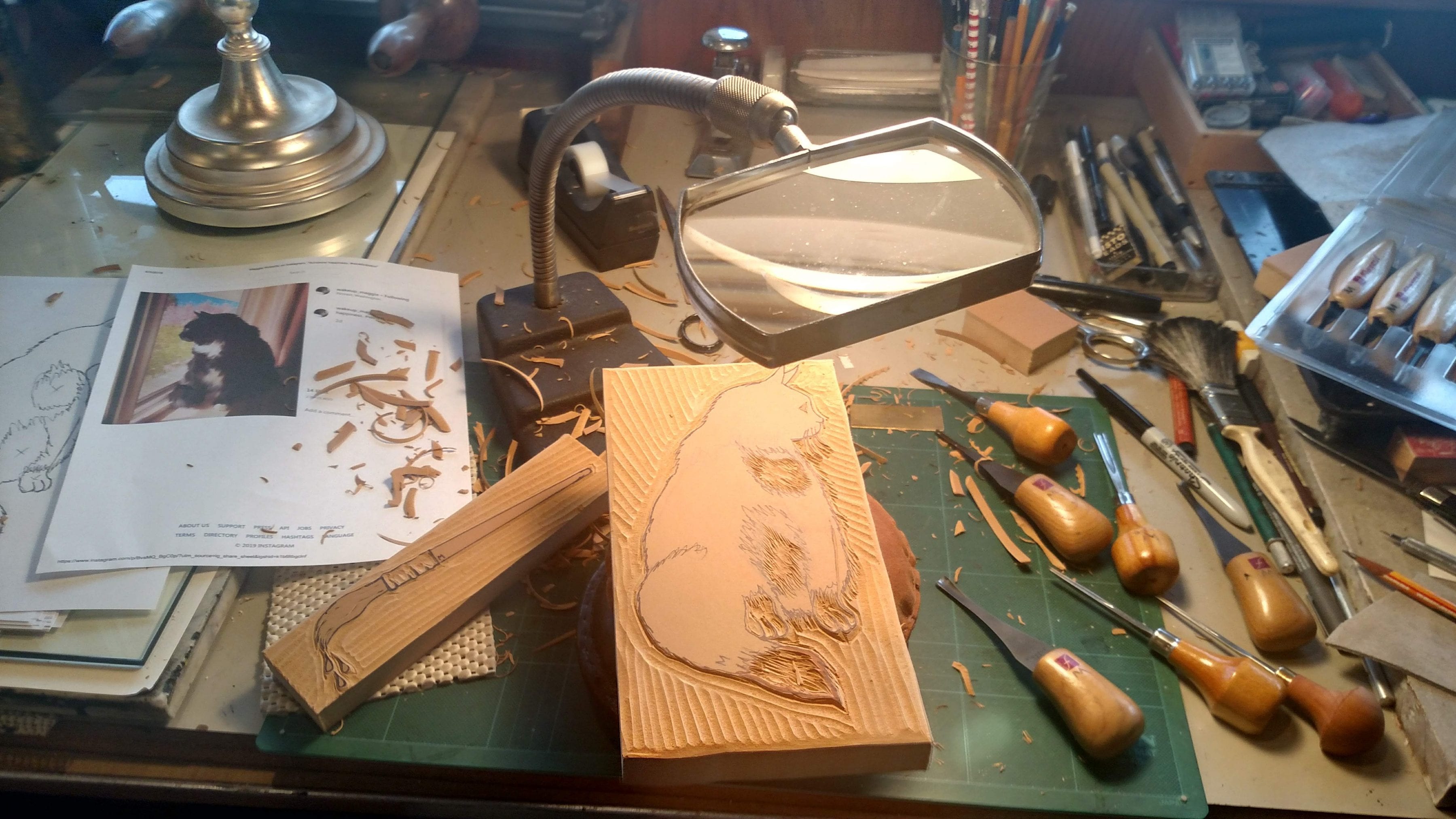
Carl is the real illustrative genius here, but at the time, I did have a sweet cat named Millie who had a white chest. We liked the idea of the paint brush dripping inky color onto the cat. Carl is quite traditionalist with his color palette (famously black and red inks only) whilst I prefer a more painterly approach to inking, so that’s always where I push him into a territory he may or may not be comfortable with!
What’s the process like to turn a poem into a broadside?
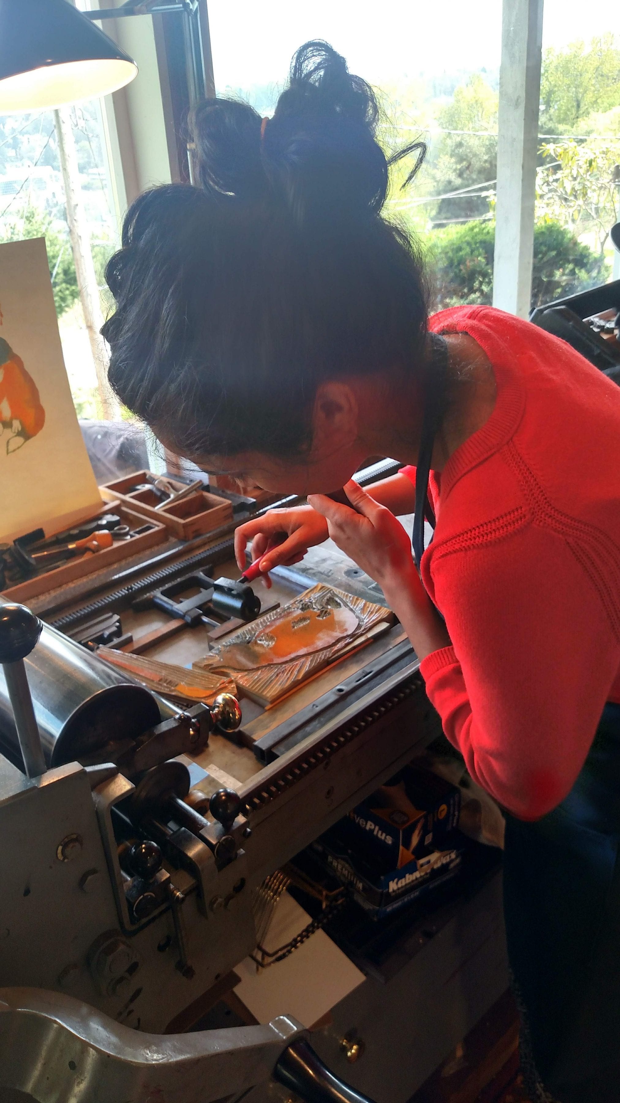
Carl and I have complimentary aesthetic sensibilities, so it’s always such a joy collaborating. We usually start with brainstorming; I supply a surplus of unsolicited opinions, and then Carl goes away to sketch. When we reconvene, we think about how to incorporate handset metal or wood type into the illustrative elements Carl has conjured up. Lots of granular planning and measuring occurs at this stage, figuring out how to make it all mechanically and spatially work. Carl gets to hand carving the image into linoleum or wood, and I set the type. We print together at Carl’s studio, jamming to some sweet bluegrass-y tunes. Carl sets up the press, I mix the ink, and we’re off to the races! Gin and tonics usually follow clean up, with the additional good company of Carl’s lovely missus, Babs.
What’s your favorite part of the project as a whole?
I love hearing the thoughts and feelings of young people, and I think one of the greatest responsibilities we have as adults is to treat those feelings with care. That’s what WITS means to us: a calling to take children’s experiences seriously, and work with them respectfully. This is especially the case with this Children’s Hospital project. Sierra and Ann do a spectacular job of capturing these kids’ voices, so bringing those poems to life through printmaking is truly the easier part, but still a responsibility with which Carl and I take immense care. We want to make art that both the child and family can cherish forever, capturing the vibrancy of these young spirits. My other favorite part is collaborating with Carl, who taught the first letterpress class I ever took, and has been my dearest mentor, teacher, and friend ever since. I love him very much. All time together is a good time.
Did this piece have any false starts or happy accidents?
When we decided to individually hand ink the carved block for each print, as opposed to letting the mechanical roller of the press automatically ink it, we thought we were being really clever and avant-garde. Little did we know that it would slow our process down ten-fold, and become extremely finicky. There are multitudinous, ungodly shades of brown that occur when yellow and green mix that I wish I’d never seen. I don’t think we would have chosen that method at the start if we had known how laborious it was going to be, but once we were in the thick of it, we were committed! I think we both like how it turned out. It feels childlike and playful, and each print is unique.
Thank you, Sukhie and Carl!