
A Decade of Letterpress: Annabelle Larner
November 12, 2020
Each year, in a project led by Sierra Nelson and Ann Teplick of Writers in the Schools, and the School of Visual Concepts, long-term patients from Seattle Children’s Hospital and a team of letterpress artists join forces to create an extraordinary collection of handprinted, limited-edition broadsides. These works of art—which you may have oohed and aahed over at the SAL info table at in-person events or seen at local libraries or galleries as they toured around Seattle—are always colorful, fantastical, and deeply felt.
To celebrate a decade of this letterpress project, we’ve asked artists behind the press to give us an inside look at the process of turning youth poetry into art, in this series of retrospectives on some of their favorite pieces over the years. Below, Annabelle Larner talks us through the process, focusing on “Dreams,” a 2013 broadside created using a poem by Colin Mayo (age 12).
How many years have you participated in the project?
Ten years! I’ve been fortunate to have printed for each year since it began in 2011.
What drew you to the poem you worked with?
I loved the rhythm of the poem, how it reflects moods, and how quickly they can change—diving down and flying high. This young poet had been through something profound and wrote it down to show these mixed feelings. Pointing high, falling down, the see-saw of life.
Where did you find your inspiration?
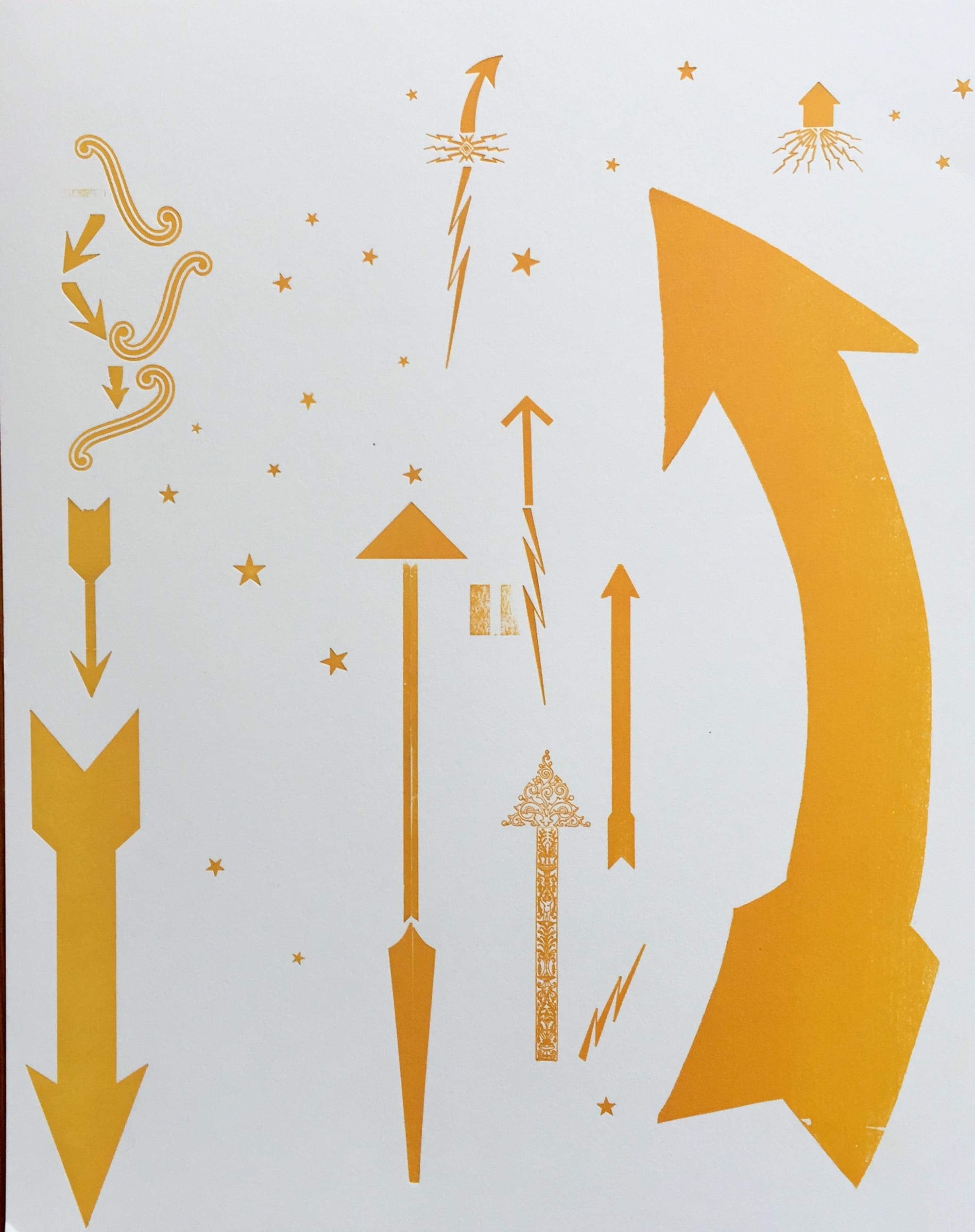
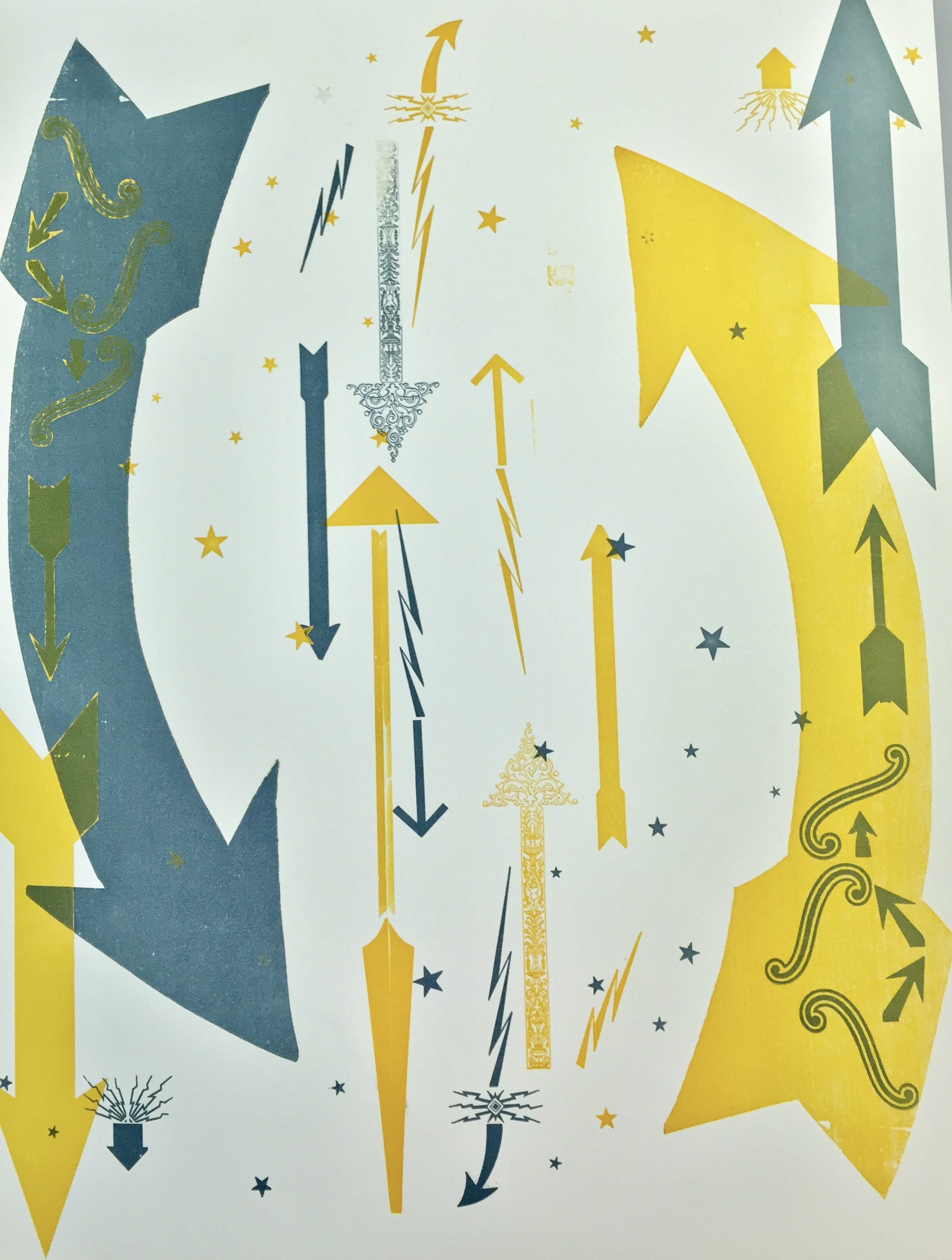
From the up-and-down feeling the poem conveyed—high, low, bright, broken. I tend to not be very literal in my printing style, so was inspired by how the poem made me feel. I thought about stars, arrows and elements of movement to show these high and low feelings.
What’s the process like to turn a poem into a broadside?
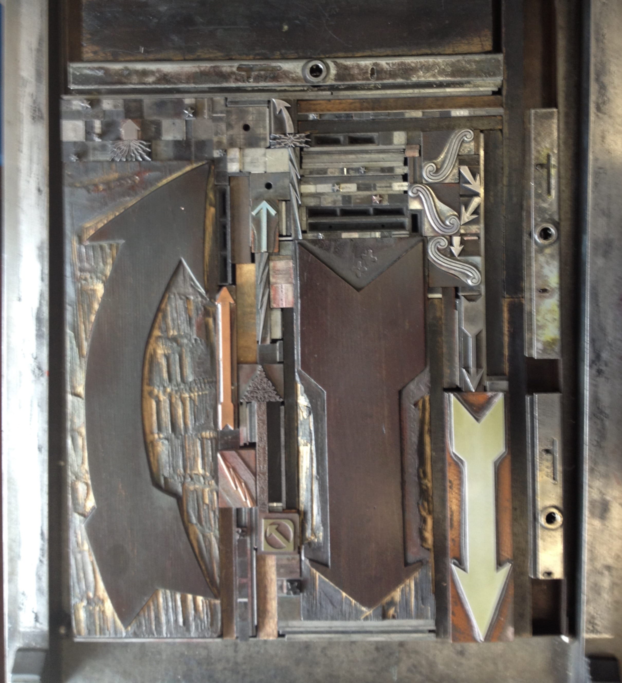
First and foremost, to really read the words and let the poem speak to you. I began by looking for a typeface that would feel contemporary as well as elegant. I chose the sans serif typeface, Bernhard Gothic, and hand-set the poem with metal type. Also, the typeface looked nice with the lines and shapes of arrows and stars from the ornament collection at SVC.
Going forward, it was a lot of hand-setting metal and wood elements and experimenting. I worked on a layout with arrows going in both directions, did test prints on onion skin (translucent) paper and played with layers. Lots of moving things around, locking up, doing multiple tests, and finding the sweet spot on the page for the poem and the overall composition.
What’s your favorite part of the project as a whole?
I really enjoy the community of printers and poets, how we all work together to make something to give back to the young poets. Making the portfolios, gathering together, printing, creating something new and fresh that culminates in one big gift to share, is very gratifying and lasting.
Thank you, Annabelle!
Posted in Writers in the Schools Behind the Scenes