
WITS Voices: Teaching William Steig
February 17, 2017
By Greg Stump, WITS Writer-in-Residence
Most people who know William Steig’s work think of him as the creator of classic children’s books like Shrek and Sylvester and the Magic Pebble. But in the mid-20th century, Steig created numerous picture books for adults: Persistent Faces, The Lonely Ones, The Rejected Lovers, and many others. Most of these works could be described as existentialist graphic literature, with the artist using captioned illustrations to explore a worldview that seems much colder and anxiety-ridden than fans of his kids’ books might expect.
A common Steig trope was to title his books with an adjective and a noun, and then explore that single theme throughout the book via dozens of separate (though thematically-linked) characters or illustrations. These books aren’t narratives, then, so much as exercises in visual and conceptual thinking: Rejected Lovers shows us all the different possible fates (denial, anger, self-pity, delusion, despair) that await the spurned suitor, through a variety of visual strategies. Some images have backgrounds, while others are vignettes; we see characters from far way or at close range, depending on what approach best serves the content.
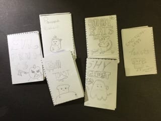
As both a teacher and a cartoonist, I’ve been deeply inspired by Steig’s little books, and have borrowed his adjective-noun approach for student projects many times. This is my seventh year as a WITS Writer-in-Residence (or Graphic Novelist-in-Residence, if you want to split hairs) working with the 6th graders at McClure Middle School, and one of my favorite exercises this year has been assigning them to make miniature Steigian works of their own (a few of which are shown in the photo above). I start this activity by displaying a list of adjectives and nouns side by side on a screen, and ask the students to create a combination that evokes a rich, funny, or unexpected theme. Then, they do exactly what Steig did – though in a much shorter, 8-page booklet – by exploring that single theme in as many different characters as it takes to fill the book. Here’s a closer look at some of their creations.
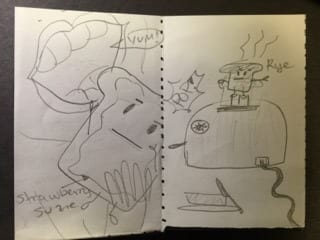
This double-page spread from Emotionless Toast by Maria F., a student in Katie Goehring’s 5th period Language Arts class, is a good example of how visual cues & details inform the reader. Note the butter, knife, and dish in the right-hand scene, which tells us what’s going to happen once the slice of rye gets puts on a plate. In the left-side image, the contrast between the wavy outline surrounding the toast’s face, and the smooth-lined shape of the toast itself, lets us know instantly that this slice of bread has been slathered with jam. We see both characters at different distances, and the varied visual approach – with the right-hand image shown far away and with a background, and the left-hand picture tightly-cropped in a way that emphasizes the blank expression – helps keep our interest up as we flip through the pages.
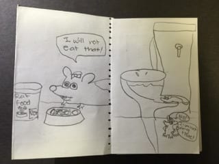
Collette A. (one of Ms. Goehring’s 4th period students) takes us through different scenes from the life of a bow-wearing rodent in her book Snobby Rats – first we see the protagonist refusing to eat her bowl of rat food, and then in the other scene, rejecting a trip up a toilet’s drain. I especially like the split-view on the right hand side that shows us details about the pipe and the toilet that we couldn’t see or know with a more representational approach.
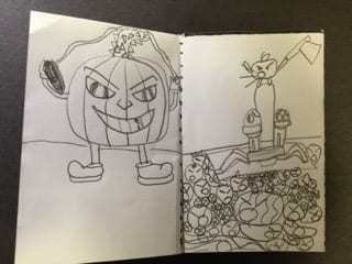
I love the details in Stuti A.’s drawings for Evil Fruit, which she created in Ms. Goehring’s 2nd period L.A. class. Again, the close-up view focuses our attention on the deranged gourd’s expression, while the other scene haunts us with the repeated angry faces in the crowd and the scared eyes of the poor, bound soon-to-be-victims (who are about to find out what the fruit they’ve been chopping up all these years feels like before the blade comes down).
In all of these mini-booklets, we can see the students engaged in the same struggle as Steig faced in his earlier works: not so much how best to tell a story – as is their focus in most of their sessions with me – but in visual thinking. The decisions at hand range from the details in an image that inform the reader about what’s happening and why, to the way those images fit together to make for an engaging, varied, and aesthetically-pleasing sequence. That their results are so often fun and rewarding to peruse may speak to, in part, how natural this way of communicating really is for us rather than the special domain of the artist. Perhaps all we really need is a structure – in this case, one adjective and one noun – and that paradoxically-liberating constraint, more often than not, sparks our powers of imagination and creativity.
 Greg Stump has been a regular contributor to The Stranger for more than a decade. He is the co-creator of the comic book series Urban Hipster, a former writer and editor for The Comics Journal, and the creator of the weekly alternative-newspaper comic Dwarf Attack. He teaches comics through a variety of schools and organizations in the Seattle area and recently completed his first graphic novel, Disillusioned Illusions.
Would you like to see more from Greg Stump? Take a look at his comic from Helen Macdonald’s lecture here.
Posted in Creativity Writers in the Schools